Monday, 30 April 2012

Colour - Kelly Lowe

I have been trying to add colour into my work and lots of my images of the northern quarter were quite dull. I didn't particularly want to any of my photos use for my colour pallet so I chose a photo I took within the cube gallery. Although the photo was looked predominantly black and white, there are hints of so many more colours in the image which is what I liked about the photo.


I went back into the northern quarter as I wanted a variety. although my images consisted mainly of 2 colours, I found tints of other colours that I could pull from the image and developed another colour pallete.

I didnt add proportions for this as I prefered the colours to my other colour wrap and intend to use it for part of my design. 


Kelly Lowe

hey guys, just wondering if we have a meeting today at 12.30?

Sunday, 29 April 2012

Weekly update - Rebecca Hayman

This week I have been taking my cut - out ideas and creating design ideas inspired by these for the new build. I have made 2 big mood boards with my designs, an artist to link with my idea, a photograph of what I am focusing my inspiration on, a photo of the part of the new build I am proposing my idea for and a drawing or cut out example to show my collaberation of ideas. I think these have helped to focus my ideas and link all my research together:


Saturday, 28 April 2012

Deborah Moses - Kelly Lowe

I like the texture created with the use of colour and the way she layers glass on top of others


TOYO ITO, Zoe Budwig


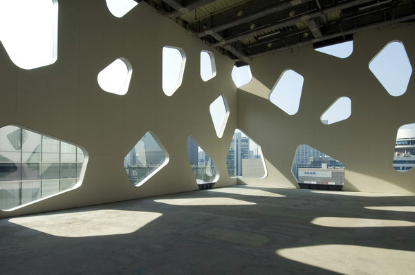
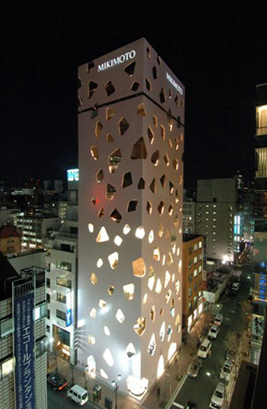
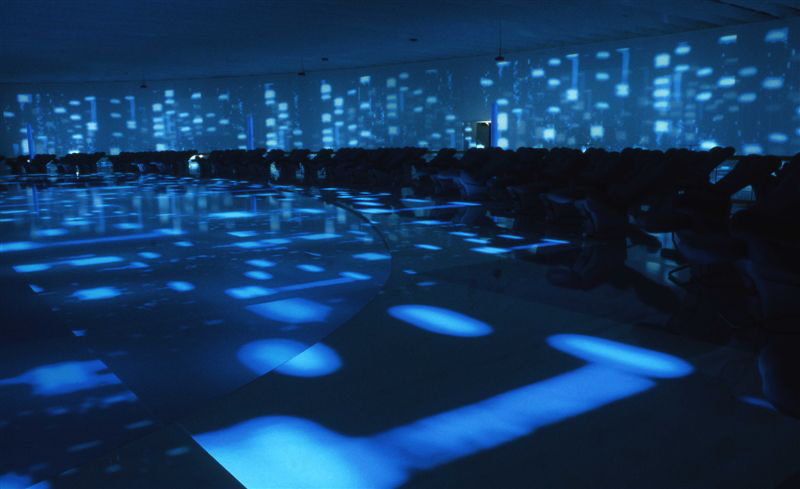
I thought this artist would be relevant to Rebecca. These images reminded me of the shapes used in her work and her idea of shadows. 


Aswell as working within architecture Toyo Ito create this installation, the projected shapes create quite a surreal environment, they also cast shadows.  


Friday, 27 April 2012

Day trip - Lois Norman

Hi everyone really think we should go on a day trip somewhere. Tatton park looks lovely, we should organise something in the next couple of weeks, we could take a picnic and draw all day. Need the weather to brighten up first.
does anyone have any other suggestions?

http://www.tattonpark.org.uk/default.aspx


Weekly update - Lois Norman


This week I have been focusing my project around the idea of folding and origami. I began making shapes and patterns out of the envelopes I had collected. My favourite are the Chinese water bomb samples. They remind me very much of envelopes and letters in the way in which they are folded, I have attached blue, white and red thread to each of them to hang them up. I also have become excited by the idea of light and space and want to work with more transparent materials.

 This fold is known as a crab I have put my own twist on it and experimented with scale to give it my own unique style..
This is the Chinese water bomb fold, its simple and effective in producing the form that I want to achieve. On mass I can imagine they would make an impact. I need to start visualising and using Photoshop more to push my work further.

Thursday, 26 April 2012

Book: Masters of Light - Rebecca Hayman

Masters of light; Designing the Luminous House.

I found this book in the library and these two images in particular I thought worked really well with my work, how the casting of the shadows work in an interior space: Thought they might be useful to others.


Book: Ultimate Lighting Design - Rebecca Hayman

Ultimate Lighting Design; Projects by Herve Descottes/ L'observatoire International teNeues.

I found this book in the library and found some interesting Interior spaces where the architecture had been made so shadows were cast into the interior space.
Here are a few examples:


PAPER BLOG, Zoe Budwig

Came across this site, may be useful for Lois.. if your still working with paper. 


http://strictlypaper.com/blog/
There are categories on the right hand side of the site. 


FLETCHER MOSS GARDENS, Zoe Budwig


I took a trip to the Fletcher Moss Garden in Disbury. It is such a peaceful place you wouldn't know existed. I have included a few photographs from my visit which I plan to work with.


If your interested in gardens it's quite a nice place to visit, very peaceful and inspirational.


FASHION, ARCHITECTURE, TASTE, Zoe Budwig


 I was looking through some images on my computer and I had these from the talk Rachel gave us at the beginning of the Unit. 

I remember from our last tutorial Danusha was speaking about her idea of creating tiles. Perhaps this could be of use to you.


 I also just really like the images below, thinking about my work with glass. 


BINITA WALIA, Zoe Budwig


I have been thinking about working with glass, and I saw that Rebecca posted about shadows and light so I thought this may also be of use to you, it is quite interesting how the window panels create shadows, which then create patterns on the walls. 


More Projects on her website http://www.thespaceinbetween.co.uk/aboutme/


Ruth Murray: Interior Contexts

Droog Designs

Accidental Carpet was designed to cheer up and personalise the surroundings, which is needed for our new concrete building: “A colourful and soft carpet to oppose cold, anonymous and grey institutional environments.” The irregular shape and unusual meandering lines of colour help to achieve this, and the soft felted material used adds a sense of comfort and home. 

"Accidental Carpet",
Wool Blankets


"Chair of Textures",
2006, Stainless steel


Stylish decoration is also an essential requirement for the building’s interior: Chair of Textures is a piece of furniture that can also be viewed as jewellery. The intricately cut layers depict parts of an upholstered chair, like wood and springs, and the elaborate design tells its life story - a resting place for butterflies, a feeding ground for woodworms, and finally its demise in a fire. The entire structure is covered with complex magical features, which is complimented by use of a single, neutral colour.


Timorous Beasties - Projects

Graphic Relief, May 2011
Timorous Beasties designs have been beautifully reproduced on concrete tiles using proprietary moulding technology. The raised pattern transforms a plain, flat material into an ornamental feature with tactile surface. The different qualities of line achieved enhance the design, which will look stunning when repeated over a large area. 

  
Welcome Trust, October 2005
This collection of stylish lampshades lights up the whole display, which looks effective due to the simple curved shapes covered with detailed prints. It is inspiring how images hidden in daytime appear once illuminated, with the familiar textile designs of Paisley Patterns and Argyle checks revealing more unusual images of germs under a microscope and interlocking syringes. Positioning the lampshades in front of a decorative curtain is successful:  the bold red and black patterns stand out against the backdrop, created from delicate Nottingham lace and interwoven with a corresponding design in pallid tones.  

Brintons, September 2010
This distinctive hand-tufted rug caught my attention due to the intense colours against a black and white background. The tonal shades of red, pink and orange feel warm and passionate, which suits its soft textural quality function of adding comfort to a room. I love the reflected design which features attractive organic patterns.


Wednesday, 25 April 2012

TIMOROUS BEASTIES (Danusha Komar)

I discovered Timorous Beasties last year whilst on my foundation but have found that I have come back to them time and time again for inspiration. Taking inspiration mainly from the natural world, they create amazing unique and modern designs sometimes however harking back to classic print designs such as their well known 'Glasgow Toile'.
   
Most of their designs have a hand drawn quality to them that I love and even though some finished products are digitally printed, they still use the 'hand made', screen printed method which I think sets them apart from many other design houses. 


In June 2011 they embarked upon a project to create window coverings for the inside of Stratford Market station in East London to provide privacy in parts of the building. They used their 'Tree Of Life' design on clear vinyl for the finished product. 
This could be an area of further investigation for my work as the new build houses a lot of glass and this is a contemporary and fun way of giving privacy to areas in and around buildings.


OPEN EXHIBITION, Zoe Budwig


  • Open, MMU Sculpture Students


    I went to the private viewing of the Open Exhibition. It was great to see 2nd year students work, as at some point we will be exhibiting our work like them. 

    Some students responded directly to the natural aesthetics of the Mill and it's surroundings. The work included installation, sculpture and performance. You can see the link to their blog below. 

    http://opensculpture.tumblr.com/


    This piece was really simple yet I found it very delicate and effective as a piece, the shape reminded me of my work. 


    The use of light is effective here, perhaps light would be effective with my glass. 


    Around the Mill...


Tord Boontje - Rebecca Hayman

Tord Boontje is an Interior Designer who is renowned for his decorative pieces. This piece in particular is called 'The Shadow Light' and was designed for a child's bedroom.
I love the way the images on the light create gorgeous shadows on the wall and shadowing is made even better with the added refraction of colour onto the walls.

The Shadow Light:


Tuesday, 24 April 2012

OLD SCHOOL, NEW SCHOOL VIDEO, Zoe Budwig


To learn the basic skills of creating a film we practised planning and filmed a short video shoot, we decided to do this as a group.


We have created a film based on the Old School and going into the New School. We tried to incorporate various shot sizes and camera movements. I personally really enjoyed creating this film, I would never have thought of doing something like this before, but I am definitely going to document my work somehow digitally, whether it be the making or the final piece.


Not too bad for our first attempt!
Here it is! ENJOY!!! 


Monday, 23 April 2012

Ruth Murray: Moving Image Ideas

Film has become increasingly popular with textile designers and companies who use it to communicate information to a worldwide audience of clients. Our final work will also be presented in digital format, projected onto citywide billboards or published online on the unit X website. 

Company advertisements


Target's "Dreaming Girl" is a stop-motion animation made from a series of still images, creating jerky movements which look effective in this fast-paced adventure. It is fun, colourful and exciting since the images constantly evolve into something new. 


“The Pen Story” by Olympus is extremely clever as it follows a man’s life but also involves a story of the camera itself. The process of producing actual photographs and reanimating them was very time consuming: 60,000 photographs were taken, 9,600 prints developed and then over 1,800 pictures shot again. 

Further Ideas:
  • How to make an item – An instructional film with titles and hand-drawn diagrams explaining the stages of making. 
  • Document the production of artwork – Digital work can still involve creating actual objects using a camera to record the process of making, the speed of which can be increased or decreased in the film.

Fine art films
These are unusual and conceptual pieces compared to company advertisements, which are more entertaining and commercial.  

Laura Buckley works with light and space when manipulating objects to produce atmospheric films. http://www.laurabuckley.com/

"You Be Mother", Film Still, 1990


Sarah Pucill projects photographs onto physical objects, which are moved around to change the image.  “You Be Mother” involved projecting a still portrait projected onto a crockery set, the components of which are repositioned and combined to dislocate the facial features and portray a powerful narrative about relationships.  


Michaella Nettell’s film “Under Skies” uses mirrors, glass and projections onto a rippling water surface to create reflections and blurred, distorted imagery with a surreal feeling.


Sound is important as the type of music affects the mood. Consider whether the film should be silent or include music and sound effects.

Kelly Lowe - Kelly Lowe

I am looking at the idea of 'Secret Manchester', and my arrivals task was based on the northern quarter, as for me it is a memorable place and somewhere that I feel reflects creativity and individuality, I started photographing the buildings in the area that showed an element of secrecy but was unsure where to go next, but after my visit to the cube gallery and the exhibition on the hidden proposed underground and assistance in a drawing workshop, I photocopied them onto acetate along with my drawings, and I found the photographs looked completley different to how they were in real life, on the computer and on acetate. I played around with the photcopier blurring images and overlapping them to create patterns which gave me my idea.


Although this does not look too interesting, I intend to cut parts out and fold others to create a pattern on the projector and project it onto the wall so I can develop a large pattern from this